Monday 12 June 2017

Team Art Book

This is a small addition to the Synoptic Project. All it is, is a collection of work for the project between my team. My part of the Art book consists of Wireframes, Renders, Sketches and Concept Art. I am happy with three quarters of what work I have out into this. This mainly comes down to work I did not have to come up with, in the last 2 weeks.

The renders were of both the main models that were done in Sketch Fab (once I figured the website). They did work fairly well, and look better than the standard rendering software in Maya. I did try to use the software "Arnold", however the software would not work with my Maya program; so I cannot compare the rendering software. No idea why considering that I downloaded the program and plug-ins.

I have both low and high wireframes for both models. They are from the top, the side and the front. They are definitely the easiest to get for the book.

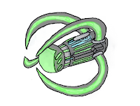
The main issue was with the concept art. I'll say that I am just not good at drawing and painting in software (adding the pressure of a deadline within a week didn't help). I did two drawings of my models. I did think the Alien star fighter was alright, however I do not like the main player star fighter. I think that it is misshapen and blurry. I created these by first drawing outline of the objects on paper to using as tracing paper for computer software. The software I used is a new software I am trying to get the grips with called "Corel Painter 5" this was a part of a package with a graphics tablet I recently got. I hope this will help me in the future. I did use more than basic colour in these images however. I did add glowing effects with a faded airbrush around the bright light. I also tried to add a few differences between the actual models and the artwork. To improve this (like most other issues I have had over the past year) I need to practice with both technique and software.

The final  work was the sketches. I mainly did these as ideas for the player ship I had that we did not get to use. All (three) of the sketches have descriptions of what each part of the ship resembled and ideas of what it could do. Aside from the sketch that turned into the final design, the other two showed how a small pod could connect into a larger body for a more advanced star fighter.

Aside from other other additions from the rest of the team (such as final game renders and UI designs) I am happy with what I have provided not just for the art book but for the full Synoptic project (even though some parts do need some improvement). Next up is the portfolio plan.


Player Star Fighter Finished

After a ridiculous stretch to this point, my final version of the main player star fighter is finished. Am I happy with the final product at some points,  however I know that there is some room for things that I could have done better with my own abilities.

Firstly, I am happy with half of the objects of the final model completely. They would be the engines, the primary and secondary weapons. Mainly because I had a complete work flow with them. I am espically happy with the  The other objects (the wings, the body and the latches on the wings) did not. Why? Because in the work flow for them, there was a major error that snowballed into more problems down the road. Example; the body lost all of its UV's when it was transferred into Mudbox and I did not notice until I had finished sculpting the mesh. Another problem is that you are supposed to give a mesh more polys when the base has been done in Modelling software, to be able to sculpt the model with detail in another program. However not all polys are the same size and because of that, you want more polys on some faces but not others. This can cause major frustration. This was a problem for both the latches and the wings (a minor point is that I wished the oranges matched, instead of becoming darker the more to the center an object is.).


Another problem I ran into and still have no idea of how to change, is a problem with the paint layers. The black paint in this image was done with one straight paint stroke. I still don't know what is causing this, you can even see it in the the faded orange above the black. It could be with how the poly shells have been set out, but this has never happened with any other project.

Since the deadline for my portfolio, is the 16th of this month this is finished for the deadline. Hopefully from this long and frustrating experience from developing my part of our Synoptic project I can use what I have learned to not have major issues like this in the future.

Wednesday 24 May 2017

Distinctive World Post


Distinctive World and Artstyle                                                                                Matthew Lawson

There have been a large variety of art styles across history and some of them have lived on as iconic for many parts of society. Sometimes an artist's style defines not only the piece of art but can define what the artist will be most well known for making. In this, I will be doing over the two distinctive styles to create the ‘Alien’ universe; by the styles of H R Giger, Chris Foss and Ron Cobb.

H R Giger became well known because of his designs and artwork on the 1979 film 'Alien'. He created all of the designs for the extraterrestrial parts of the film, including the Xenomorph designs. The idea behind the artstyle (which would be become known as Biomechanical (mixing technology and life forms)) is Giger had night terrors and tried to visualize his nightmares into his original drawings. Some of the original art pieces that he created were known as 'The Astro-Eunuchs' and ‘LI L’. Giger's idea was to combine machine, environment, and human with sexual undertones. A lot of the concept art designs had subtleties of sex, even some of those ideas made their way into the final film. An example is the Xenomorphs inner mouth that evokes “vagina dentata” (a vagina with teeth).

His ideas were first turned down from the production of Dune, until he was brought on to work on the production of Alien with Ridley Scott. However some of his style can also been seen in not just the creatures he created, but the sci-fi ships he designed. Some of his original work was designing starships with the same style. His concept art for Dune follows the same style but up-sizing the scale of the created art with the same principles in mind.

Image result for nostromoThe other half of the design was the human technology mainly the design of the ship 'Nostromo'. Ron Cobb and Chris Foss combined ideas created the concept of the spaceship. They mainly based the exterior of the ship with ideas from Gothic horror movies such as Nosferatu (trying to make it a floating Gothic cathedral). They had certain locations, buildings and environments in mind when using the style to create the area. To create claustrophobia in such a large environment, they made the interiors very closely compact with very long corridors and no side passages. Compare this to designs of Star Wars 1977, the corridors on the death star for example have multiple side passages, have turns along the path and is fully lit. With a straight path (with no side paths) it subconsciously adds tension; because the fear that something deadly is on the other side we have no options than to run straight forward or back, where the threat can easily spot you.

Combining these together created a claustrophobic and isolated universe, which set the standard for the rest of the Alien franchise and many other projects afterwards.

Image result for the thing 1982Other creators have taken some of those ideas and created their own films.  Examples are the ‘The Thing’ 1982 (an isolated environment trapped with deadly threat), ‘Predator’ 1987 (being hunted by a threat you don’t know if you can kill)  and ‘Inseminoid’ 1989 (an alien threat with more explicit sexual tones for fear). A game that uses some of these ideas is the 2008 game ‘Dead Space’ (being put into long, tight corridors and trapped in rooms with enemies that you are not sure where they are).  
All of these examples, however all take from the Chris Foss and Ron Cobb artstyle. As for H R Giger; the idea of Biomechanical beings in the modern media, the artstyle mostly died out. One of the few games that used the idea were 2D shoot em up games, such as R-Type (1987), and one of the very few movies that has used a Biomechanical for some assets of a production is the 2016 movie ‘Independence Day Resurgence’ and the video game ‘Warframe’ (2013). Specifically for the Alien concept art designs, however it does not have the extent that H R Giger uses the artstyle. The style of Biomechanical has mostly been taken up by tattoo artists such as Eric De L’etoile.

Image result for alien isolationHowever the main example of both off these concepts being put to use again, has to be part of the Alien Universe, the 2014 game ‘Alien Isolation’. In a way the premise is similar to original movie “Go to an isolated location and get trapped with a monstrous threat you cannot face”. The way that the gameplay uses the concepts from the art concepts of the original film is by, forcing you down long, gloomy and tight corridors. With openings along the walls and ceiling so it can keep you guessing where the Alien is. This also corresponds with the way the Alien functions; it has an unpredictable pattern of movement it can show up anytime it wants. If it finds you, you are done for because the Alien moves faster than you and will easily track you down.

Image result for h r giger artSo, how can these artstyles be used in future productions? Considering that the styles from Cobb and Foss have been used in a decent amount of productions, I want to focus on Giger. The main problem with branching out this idea is that it is meant to physiologically creep the audience, while having sexual undertones to through them off. Well an idea is that in a distant dystopian world, Humans (or another sentient species) have become enthralled by Cybernetic enhancements, they have become as close to androids as possible, fooling themselves into still thinking that they are humans, by trying look like what they remember Humans to be (appearing in the uncanny valley of humanoid designs), by slowly showing how they changing into something abnormal and eerie. Somewhat similar to the Li 1 drawing he made in 1974.

Sunday 21 May 2017

SSCS Alien Starship Finished

I have finally finished one of the two main models for my synoptic project and I am quite happy with the result.

Since last time, I have baked all of the objects down to low poly versions and applied all of the diffuse and incandescence layers. Then finally put the objects together to create what the final model will look like.

A point that I learned more recently is that when Mudbox saves your model file, it saves your texture files in a separate file. If you export the texture files it can appear differently (as you can see). What happened is that when transferring an incandescence layer to a texture layer in Hypershade, sometimes it can't read some of the information on the layer. An example is using the blur tool with lighting; to cause pools of green instead of a glowing light.

I am fairly happy with how the normal map appears on most objects for the model. especially for the body back indentations and the weapon tips.

If there was anything I wish I could improve would be how the wings join up to the body, it looks just like is clipping into the main body. One more idea would make more of the indentations glows appear blue, too make the colour more prominent without overpowering the green.

For now I am done with this model and need to prioritise finishing the player star fighter. Right know all of the objects are finished with the first model and UV'ed. What my issue is now, is that I have an understanding of Substance Painter 2.  Since that texture program has better capabilities than Mudbox I might want to redo the textures. So either redo all textures in less than 2 weeks or continue with a not as good texture editor.

Adding more to detail before the deadline

In the past week I have decided that I will add more detail to my objects before it is finished.

The way that I will do this is by smoothing out the mesh in Maya and creasing certain lines to keep the mesh what shape I want, before importing it to Mudbox  and adding one more subdivision level for sculpting.

Something extra I have figured out is that you can change the look of the mesh with a material editor next to the stencils and stamps. That's why obj files are orange and fbx files are black.

The main point of the extra detail is to add dents and drops in the mesh. Compared to how simple some of the objects are in the model I want more from it. I know that I can't do this to every one of my objects, however I will try with most of them.

Since I have started to properly understand 'Substance Painter 2' I will texture this object in SP, then see how it will look, compared to the rest of the model. Since SP has more options for the textures (such as adding metal shading into the colour), I will most probably appear different however.

Depending on how much time I have left, that will show if I use Substance Painter for the project. I will finish the objects in Mudbox first before Substance painter,so I have something to show as a finished project.

Tuesday 9 May 2017

SSCS Alien Starfighter Model Update

Since the deadline is starting to creep closer everyday. I have had to stop and reevaluate the state of work for my part of the Synoptic Project. While the Main player star-fighter only needs tweaking, the main enemies need to be finished. I did finish the model and finished UV unwrapping a while ago, however it needs texturing and then baking.

After looking through a few concept designs, I have learned that alien ships have 3 defining characteristics: they look either organic, pieces of metal being gravitationally bound (like the Prometheans form halo 4+5) or being as lit up as a disco ball because of glowing lights. So since lighting is the simplest one to get right I went with that.

For a while I was still not to sure what colour scheme to use, I originally wanted a main purple and secondary green.  However I have gone with a silver and green colour scheme. I got the idea from the "Xcom" plasma weapons. I have tried to make the placement of the colours seem meaningful, to show how the ship can function (and to make it appear cool). The silver is kind of a no-brainer for a colour palette. As for the green though, it has a uneasiness about it; as it has always been associated with alien life. Not to mention it contrasts the player Starfighter (who I made glowing orange).

The green spots were achieved by creating an incandescence layer and making the colour very light green. Around the edges I used the blur tool not just to smooth the edges of the paint out, but to add glow around the green light. Something I am happy with however is the addition of a tint of blue on the main cannons. Instead of the model being entirely glowing green I made the weapons glow blue instead; I think it looks nice. The way that I did it was have 5 separate shades of colour between green and blue and then blur the edges of the colours together. The only improvement right now I can think of is to get the colour at points to look brighter.

My main tasks now are to clean up the textures for my current objects and to put together the the starship by the end of this week.

Industry Standard Project First Version Finished

I have finally finished my typewriter model. This doesn't mean I am finished with it yet however, this is the main focus however I know I can add more before the deadline of June. Sine last time I have textured and baked the keys and have cleaned all of the main texture issues.

I have learned that some rendering software (such as Arnold) are better than others. Sometimes (like in my other blog posts) Mayas software can try to hard to render everything and over bake certain parts of models. As for the final render of the completed object I am mostly happy with it, all of the objects look fairly decent and fit together well. Any problems with my current objects would have to be that some parts of the normal maps don't cover up the low count at points. An example is the loop that surrounds the keys; you can see some hard edges that should be smooth.

As something else that has been bugging me for the longest time. I figured out how to change more of the lighting system in Mudbox. In the display tools you can deselect "Smooth Shader", what that does is it adds extra shadows to the model based on what angle you are at. This is helpful when the mesh is finished, however when it is still being sculpted and painted, it gets very irritating. So since it is gone when I need it, it makes the process a bit easier.

My plans for this now is to mainly add more individual objects to the typewriter to make it more complete. I have already added a small lever on the face at the front. An example of what I could add would be all of the small metal rungs and gears further at the back near the main lever. Or maybe add letters to the keys.