Thursday 8 December 2016

Industry level task Week 2


This has mostly been updating the model/scene that we want and to begin the UV process. Compared to last week my work flow is to complete the main objects I want in the scene first then polish them before starting the unwrapping the UV process.

The objects in the scene that I have included this week are the, lamp, ashtray, two shot glasses, a liquor bottle and a packet of cigarettes with 3 cigarettes in it. I have also added more to the type writer, the main improvement for that are now the keys. I will do one more model for the scene for now (the telephone) then update all of the models in this scene by making them smoother.

The way that I have done this process at a decent pace is by giving some models multiple objects to work on. Two examples would be the lamp shade and the lamp are two separate objects while the typewriter has over five so far. For now i will add as much detail to the scene as possible but by the end I will normal map the scene to lower the poly count but without removing the detail. As well as unwrapping the UV's in the scene and texturing, other elements in the scene will be the lighting too add to the ambiance to the scene.

My main problem now is that the typewriter has a major drop in the top and how to do it right is going to be a problem.As well as finding a way to make the shot glasses clear rather than opaque.

2 Point and 1 Point Tracking

This week we tried other ways that tracking works in after effects (i case you didn't know I tried a point tracking task last year to have a lightsaber effect from recorded footage). This time we had to create a one-point track point in a created set of footage.

We had to create 3 extra layers to get this effect to work. Like before you need to find a position in the footage that has contrast to that the tracker can stay in the same location while the footage moves in the scene. Each tracker has an outer and an inner box. The outer box is the area of where the tracker finds the contrast the inner box is the point where the contrast should be found, without this the marker would fly across the screen again and again. Before it can be used however you need to apply it to the footage first.

Once we found the location and tried out the tracker to make sure it works well. I added another layer underneath the tracker to make the image imported into the footage look like it belonged there.

The extra part was trying out 2 point tracking in a different piece of footage. These 2 points are where the points go in the footage but the final purpose is the same as one point tracking. This version is for put an object where no contrast exists.

I will say that I understand this process but it is annoying to fulfill the task. Plus the final result could have been smoother than what it is. I would like to do some practice for this however I don't know any alternative to adobe after effects without paying the £50 a month for all of the programs.

Monday 5 December 2016

New Modeling Task (Industry Level Standard)

This week we started a new modelling task using all of our modelling skills to create the best possible model in 9 more week sessions. This week was mostly about creating an idea, getting reference images, a few sketches and starting to model the idea. The idea that I choose was to create a desk for a detective during the 1930's.

This is an environment model since is does not contain only one main object in the scene I will be adding objects such as a typewriter, lamp, ashtray, liquor and a office chair. I will do these objects in the difficulty that they appear to have so immediately after the desk I worked on the typewriter.

Any secondary ideas I have are making a back wall with blinds and having papers on the desk. The style of this will have a noire look to it.

The main point that I have to use in this environment is to use many more individual meshes for each object. However planning for the future you can colour code your meshes for the object to have similar textures for the final product.

Now, since this is an environmental design I am not going to fully detail every poly in the scene. There are many ways that I can do this an example would be using normal maps to achieve a good look but without imploding the poly count. Another point that was given was to constantly bevel many edges to look smoother because not too many objects have really sharp edges.

Other than that my only goal is to finish all required objects before the beginning of next week and I will improve my assets as I go along.

After Effects/Illustrator Logo Update


I have been working on my logo since I finished my logo assets in Illustrator and to combine them together. Aside from my plant and my moon, I have added a background and sub-assets in the final design.

I have done many things to improve the look of my logo. It will appear better in After Effects when all of the particle effects and lighting effects are added into the short six second animation. Firstly, the plant hasn't been changed for now (even though I have a few ideas) , the moon has had editions. I have added more ellipses in front of the main asset, with different shades of white and black to have more relation to reference images of the moon. To stylize this, I changed the outline of the moon to a more of a rough pencil outline.  Finally for the moon, I have added a major lighting effect to make the moon shine brighter from the background, this effect was a radical blur that was scaled outwards. 

Secondly, the sub assets in the shot are the stars, the hill, the background and the title. The stars are all small, white ellipses that have the outlines blurred out. The hill was created with the pen tool to make a un-even semi circle and have a colour gradient horizontally to add the colour on the hill, combining light green, dark green, and some brown. The title is something that the logo needs but it is subject to change.

For now I am happy with my progress with how it visually looks, but to get the animation done the next steps is to work backwards to the first frame I want the animation to start since this shot is the final frame for the logo (but without the particle effects). Aside from the things that I want to improve I am happy with my progress.

Thursday 1 December 2016

3D Tracking Shots

This week, we created a 3D tracking shot in after effects. The way that we did this is was by creating a 3rd dimensional title in a recorded piece of footage. This is just another feature in after effects to use in the future.

This is one of three forms of tracking in after effects, (1 point, 2 point and 3D tracking) This is also the simplest form of tracking in a piece of footage.  Firstly, we had to use a new format for this task to fit the footage and also lower the quality of the footage so it can load at a better pace.

The way that this was accomplished was by, having after effects analyse the footage in a 3 dimensional space to create tracking points across the screen. The point represent where after effects thinks that it can hold that point throughout the piece of footage. You then connect three points to create a triangle that you then use to position whatever you want in the shot. The reason we used are names are just because the are easy to identify in the shot and you can see effects in the VFX effect, including a lighting effect in the middle of the word.

I am happy with the final result of this task and that it works perfectly fine in after effects. The only thing that I can think of that will improve my work is learning more about the other 2 ways of tracking and if I was to do this again, I would add extra effects in the shot to make the 3D writing appear more natural, such as shadows on the ground.


Monday 28 November 2016

Mudbox Lunch Crunch

This week we put our Mudbox skills to the test. Framestore has contests to get college students to compete to get the best models. This time they let us have a 2 hour time limit to create something in Mudbox, the description they gave was 'your specialization'. Considering that this was incredibly vague they let us choose anything that was personal to you but to make a brand new mesh with the idea. You start with the preset mesh of the sphere and model away.

To create this the images that I chose were the 'Dark Souls Black Knight Helmet' and 'Sauron's Helmet' from Lord of the Rings. I tried to combine these ideas into my Mudbox mesh. This was my result, as you can tell my result could have been better than what it was. My main problem wasn't with the pressure the design or the idea. My problem was the program Mudbox, the reason for this is the way that Mudbox operates is that it creates a backup save file that is used for saving the file if the program crashes and allows you to undo the mistakes that you have done in your recent history. The machines I was working on had an over saved memory storage so it couldn't have the back up save file all of the time. This left me constantly trying to fix my mistakes without any way to undo them and trying to fix the program. I eventually switched where the back up was saved, with a spare USB, but by that time I only had 40 minutes left.


The way that I tried to combine the ideas was taking some parts of the designs and putting them together and altering them if needed. Comparing both designs the black knight helmet has a more smooth look to it while Sauron's helmet has much more doing on with additions. However without any form of colour texture you can't see any form of the original designed helmet colour palettes.As the mesh stands on its own however I can say that I am happy with the fact that the glowing orange  worked well with the rough stamp brush that I used to give the outer layer a more rough in certain places (even though it looks more like wood than metal).  One more thing that I am happy with is the lances on the helmet, that they have pointy ends without have in a very random size ratio to the helmet.

Overall, I am happy with what I did do, but what annoys me is what could have been if the program actually worked fine. My mistake this time was assuming that the program will work flawlessly, I need to check the program for events like this in the future. Tool-wise a improvement I can think of is combining tools to have a smoother look for the model without flattening the models surface much. Before I work on this improvement though I need to finish my other work first for now.

Sunday 27 November 2016

HTC VIVE Try Out

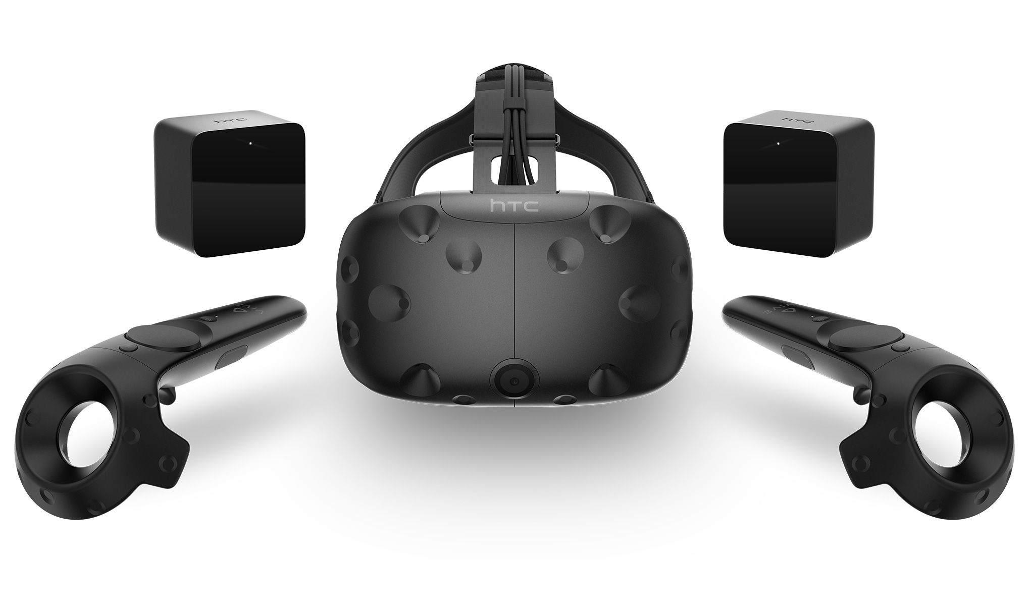
Image result for htc viveToday I tried one of the Virtual Reality headsets (the HTC VIVE). This was my first try of virtual reality I have ever tried. This was basically my first impressions of how it functions and how well my experience went. The game that I was able to go on was known as 'The Lab'. If you do not know what that is, it is a game that was created with the main concept of VR in mind. It is a collection of 8 mini games connected by a hub. All of the different games, use a different functionality of VR. I was able to go on 3 different mini games, Secret Shop, Postcards and Xortex. The way that it works is that the game starts in a hub that can transport you to each mini-game. The controllers represent your hands in the virtual world with a button underneath the thumb, one button controls the movement and the other controls your actions.

Image result for vr the lab secret shopSecret Shop was an exploration game of where the play looks around a shop inspired by DOTA 2. The main point of this game was the interactions with the stuff in the shop. You can even activate a few spells. The responses in the game work well and nothing felt untouchable. The sound design also were able to immerse you into the world. The handheld remotes acted as your virtual hands. Although I didn't get to experience the full game of the secret shop but what I did experience was very pleasant and well put together.

Postcards was more of a virtual holiday to some country side, the main point of this was only the movement from my experience. You only see parts of the country side and only get to move to certain places with about a 12 shift movement limit. Other than that nothing else happened in the game for me so I can't give much of an opinion on this, except for the fact that it was rather boring.

The final game 'Vortex', involves using on of your hands controlling a small space ship avoiding other ships and lasers. You use the button on  This was defiantly the most fast paced game that I played. Since your hand is the ship it has major movement abilities, however the screen is filled with hostiles very quickly, and since that it is in a three dimensional space it has an auto-lock feature. This game works very well and controls well. However it is still a simple mini game, when compared to Geometry Wars it doesn't stack up as well.

Overall, this was a nice experience in VR but what I am concerned about is about the longevity of VR. This could be nothing more than a gimmick, like motion controls. The other thing is that the game made for systems like this are going to be in a really niche market, they are really going to have to push for major publicity in the mainstream median. However, in-terms of creating a virtual reality feel the system does have that in certain games and creating unique but uneventful games.

Friday 18 November 2016

Finishing my Character Model for Now

This is going to be the final update on my Golem for a few months because now we are going to focus on the Environment Design Project.

In this final week, I have textured the model with multiple paint layers and multiple layer types. However firstly, don't paint the model after all of then detail has been because it can erode away the detail. The way that this works, is that the brush that you use has a strength power like the sculpting tools.

 Another point, is that I kept getting this message again and again when trying to paint the model. Apparently, it was because some of the polygons in my UV unwrapping didn't make it inside of the tile border. Although I could not find any proof of this.


The colours that I used were mostly grey and beige to give a rock and stone skin, mixed in with some brown to give an impression of dirt. The light blue was an idea to give the model more life and intrigue. The way that I did this was through different layers of texture. Diffuse was used for the basic colours in the image and a new paint layer 'incandescence'. This new layer adds major shine to the colour you are applying, you can also edit the brightness of the texture to give it more life. Then I applied a stamp to the model, to add extra texture detail, this is the result of the black veins across the model.


Once the textures were fully applied, I then move a high and low poly version of the model back into Maya. The models were then baked together on a normal map low give the low poly version of the model the detail of the high poly model, just like with the cube 2 weeks ago.

This was the result, from this angle they appear very similar even though the low poly version (the one on the left) has less poly's to work with.

Even with the extra lighting effect, they are remarkably similar. Plus, in the lower light some of my original detail got through the texture.

After this long road of work I am happy to end this stage of my character modelling here for now, given that we will be working on other projects this going to stay here for now.

My high points are that, the detail and modelling in Mudbox went well, the texturing went well with the model, the overall look is pretty good for a first character model and I finished this project before its deadline. The bad points are, while the UV editing is better in Maya than in 3ds Max it still took a while to get right, the first stages of modeling could have gone better (with multiple errors) and remembering to save my work around 20 minutes every time in Maya to be safe from it not crashing and losing a lot of work. So overall I think that it turned out good but I can do better.

The Beginning of the Environment Design Project and Plan

If you don't know we are starting a 3d environment project. The theme for this is mixing Norse Mythology and Future Technology. The first stage for this is to create concept images and thumbnails for ideas in the final environment.

This is a very difficult theme to do, without making it seem to be a Norse concept and shoehorning in technology for the sake of it. So it took me some time to get a way around this problem.
Before the development of the major project, the main work that I have done is to make thumbnails of ideas that I want to include and the first version of the environment that I want to create. I will have to finish those thumbnails nails in the next few days.

The end goal of what I am going to do for this project is to create a few 2d environmental images and landscapes, while creating a few 3d assets based of the thumbnail ideas that I have done. Considering that this task seems to be given extra points for the variety in the final project, I am hoping that this will pay off. The deadline is on the 30th of this month, I hope I can get this done with juggling everything else at the same time.

Starting Logo and Using Particles

This week we started to develop the logo in after effects, and had a try of using a few particle effects.

Firstly, we started to create the assets that we need in all of the different logo designs. I sketched out my idea for the logo first on my drawing pad before creating the assets in illustrator then importing them to after effects. What I want to create is a small plant on a hill that becomes engulfed with bright light as the night sky draws in. Then the bright light clears to show the moon in the sky behind the plant with trickling light from the sky. Then the logo name appears.

The first step (aside from having the idea), is to complete the assets that you want in the VFX sequence. This is the first version of the created assets that I want in the sequence (considering I need more practice at drawing programs I don't know how well I can improve them), the moon and the plant. The best thing I can say about these assets is that they have gradient colour coding.

The other part of the session was learning about the particle effects in after effects.The way that these usually work is from a null object in the scene, but these were created by adding a solid object layer and adding a layer style to it making the center of the scene a different colour than the rest of it.


With this we were able to test out, a few of the particle effects such as CC bubbles and shatter. We had a fiddle with the ones that we could use in the settings to see what we could create. These could prove to be useful and fun to use, but the problem is that only half of the particle effects we could use, the rest would not correspond with the solid layer.

So we are making progress and making new skills in this task, but I feel that given how little people in our group have used this program and the freedom of this small project it can cause you to feel lost in this program with no real guidance.


Monday 14 November 2016

Masking Effects in After Effects

Since we are trying to create major projects in after effects, this week we were masking multiple layers of one composition to create a moving, effect heavy animation using shapes an backgrounds.

The main reason for this attempt was because the first project that we are going to work on is creating a company logo, like you see at the beginning of cinematic movies.

Firstly, something to keep in mind when you are using adobe after effects, the program does not have a copy of the file that you are importing, so if the file goes missing in your drive (even if you have a copy in another memory drive) adobe does not contain the file anymore so it becomes a complete error for everything that hasn't been done with a tool in after effects. I will need to remember this in the future because of the consequences.
This animation was also made in 3D space allowing more options of using the layers of shapes. Aside from rotating the layers, the other effects that I was able to add was changing the opacity of some layers as the animation goes on and brightening certain places in the layers to seem to add more to the animation. The idea of creating this was to make a somewhat obnoxious TV add that you can sometimes see that causes your eyes to strain. Just to try out all of the features and timeline capabilities in after effects.

The only point I want to do better on (that are in my control), is to try more distinct effects in the animations to give the clip some unique charm. I am happy however about the fact that I was able to blend the layers well together (when I had actual colour since the files got deleted).


Sunday 13 November 2016

Moving from Maya to Mudbox for my Model

After I have finally finished unwrapped the model I have been working on for a while now. The next few parts will be to detail the model in Mudbox,  import a low and high poly version in Maya and 'bake' the high poly model on the low poly version with a normal map, just like the box last week.

This week, was trying to do as much as possible in Mudbox with the tools and techniques with as little time possible. Firstly, a while ago I had a problem that Maya and Mudbox's scaling are very different, because Mudbox down scales models massively. You can upscale the model with the scale tool in the select/move tools, the problem is that if you do not take notice of how much you upscale the model it can crash Maya if you re-import it. The other main point is that if you use something like the inverted sculpt tool, if you dig to deep in the mesh it distorts the polys in the dip. However a good way around that problem is to add a slight dip in the mesh and use the grab tool to pull the edges over the dip to make the valley seem sharper.

Since we are now trying to add detail, the main points for this model that I have to add cracks, dips, creases and adding rough rock textures all over the model. This going to take up the next week or two of modelling to get it done well enough. The main points of detail that I have begun to do and what I am going to do is add slight crevasses all over the mesh(as shown in the full view), deepening the cracks around the joints, use the stamps with the sculpt tool to add slight geometry with a rough look and add slight parts of plants across the mesh such as moss.

Sunday 6 November 2016

Preparing for Environment Design 02/11/16

To prepare for the major environment design for the 30th November, we began to use Mudbox again for a few small projects to prepare for the major task.

The task is too create an 3D environment in Maya or Max based on a theme. The theme that we were given was Norse mythology mixed with future technology.  I have a few ideas of what to do for the project. Even though it is a very difficult thing to connect together without it being a mess.

To practise Mudbox we created a rock... Sounds kind of stupid but in a way it works. The way that this worked is by using most of the major tools to create the mesh, but the texture was created by using the paint brush and adding stencils on the mesh, this adds a texture onto the mesh. We found our own textures to 'stamp' on the mesh.

The texturing works the same as in most other drawing programs with layers with your textures. You can also add extra detail with stamps for small cracks and eroded rock.

The only other point is that since this only a model that will not be used in a scene is that I can add as many layers of polys that I want, the more mesh layers you have the smoother it looks and the tools seem to look better as they carve into the mesh however it takes more processing power to not lose frame rate or freeze the system. Finally, considering that there is no wrong answer for creating this I did not find anything difficult , so it is just using the tools in the future.


Normal Displacement and Bump Maps


This week we had to learn the difference and properties of different uv maps. The main focus was on using normal maps, before we are going to do this on our character models we tried this on a cube because the way that it is done can get overwhelmingly complicated fast.

The overall task was to create a cube (the left) and create a higher poly version of a crate (the middle), then 'bake' the high poly crate onto the high poly crate. Once the cube is 'baked' all of the detail is then imprinted on the regular cube
(the right). Even though the geometry of the cube is not altered at all, it acts like the higher detail model, including the effects that it has such as lighting and casting shadows. Even though up close you can tell the differences in the models, from a distance or a tiny scale it would not be apparent to the viewer. This logic lowers the amount of polygons that need to be in a scene.


Normal maps, a map of what your geometry's normals are, This can create an illusion of anything form height to to lighting. This takes advantages of real-time rendering of how your model maybe affected by different angles of effect, in all three axis' in a 3D space. The only main problem with this map is that it is difficult to texture because of the way that the colour is done on the uv map.

Bump Maps, a map that is greyscale that acts like a pseudo-height map. It creates an illusion of raised or lowered details on a surface. Anything above 50% appears to pull up out of the mesh while below 50% appears to push into the mesh.  A problem for these maps is that they can easily be broken if the camera views the map from a wrong angle.

Displacement maps, this is a height map that affects the geometry of a model unlike a bump map that only gives and illusion. This generally applied to lower poly versions of models to have high quality detail while keeping the mesh easy for animating and rigging. A big problem with these maps however is that they require major processing power to create all of the alterations on the mesh because the geometry additions are rendered in the scene.

Friday 4 November 2016

An Odd Technique in Illustrator 15/10/16

 This week we tried a new way of creating concept art ideas. The way that this worked is we created a image (in our case a rock) that we used like a brush to create an image.

To start (we did this in Photoshop), I used the lasso tool to create a random polygon. I then filled it with grey. Then I split it down the middle to split into a lighter and darker grey to signify the light and shadow on the rock.  To enforce this I then took a small brush and made it white. I then drew all across the lighter gray.

On the other side I drew across the darker side for cracks on the shadow side.

This way that I drew this gives the impression of one of the slender posters form the horror trend from 2011-2013, because of the styles in both images.

After creating the rock and transferring it into a brush I then went on to create a layer by layer image using this brush. The image on the left is what I created. This is all created with the brush transferred from the rock image. The different layers are represented by the brightness of the paintbrush and the brushes opacity. They did not given an idea of what to create however.

The final point was to colour the image
The purpose of this exercise was to try to work with the tools in illustrator, considering that the animation and gaming industry use a large variety of programs and learning as many as possible is impeccable.

The main improvement that I could have done is what the final image appeared to be, even though it can be seen as nothing more than interpretation, The task itself however, ignores all of the detail in the first image.

Once again I don't know how this will be relevant with the rest of the course aside from using tools in certain ways.


Thursday 20 October 2016

"Special Jam" Time Trail 17/10/16

I did a time trail with the rest of my next gen group to try and get us going back to our pre-holiday mind set. The way that it worked is that we had 2 hours to create something that can represent a keyword. This time it was "Loop".

As you can see from the image, I decided to create a model of a desk fan. Why? Mainly because the word loop can apply how something repeats in an endless cycle. One of the best way to see that are thing that go around in a circle, and I just thought of a desk fan because I had other ideas such as creating a landscape of a racing track. The reason I did not do that is because I only had 2 hours to finish, and to make it interesting the landscaping would have to be altered by a large amount.

The only criticism that I got was that the fan should have been spinning in the cage. Aside from the time limit the reason for this is because I don't know how to do animation in 3ds Max and because the fan blades are part of the main body of the fan mesh.

The main pointers from this experience were that, for the bars of the cage were all extrusions from the rings however they were to thick for what a fan appears to be so I scaled them down however this affected the ring to make it abnormal. So adding in a small extra extrusion at the base of each bar stopped the unwanted scaling. The other point is that (for me) there are a few extra shortcuts that I never knew such as double clicking on an edge highlights the entire edge loop. This was useful for using the chamfer tool, too smooth out parts of the model like the fan blades.

The main point that I took for this is that the company Framestore sometimes does time trails from all that are willing to participate in the challenge. This can be something I can use to keep my skills with different modelling software.


Sunday 16 October 2016

UV Mapping In Maya

This is the return of the most tedious task in 3D modelling, UV unwrapping. This time around it was done in Maya instead of last years 3ds Max. After finishing the Mudbox version of the golem I imported a lower poly version of it back into Maya. The reason for this is because the amount of poly's that would have to be taken into account for the high poly model would be over 33,000! The lower poly version is around 6,000 but it will still have the amount of detail that the high poly model will have for the textures.


This task was much easier in Maya than in 3ds Max, because you don't have to register every polygon individually and scale it. You treat the polygons as like a 2D cloth in pieces to peace it together. The way that I UV-unwrapped the model is by taking one part of the model and splitting it down the middle (like vertically down the middle of the arms). Once in two parts the polygons are then smoothed out into a flat plane and scaled right to size the planes are then sowed together in one of the cuts of where you want the texture rip to not be visible.

This tactic also applies to most of the model including the arms, legs and torso. However the hands, fingers, the head and the feet have a bit more complicated. Some specific features need individual parts to get there own mapping. Next week I will finish the mapping of the model and start texturing.

Drawing Story-boarding and Concept art Catch-Up

For the past few weeks I have been taught a few drawing techniques for concept art and storyboards, some of them have stuck but most have not, a main reason for this is that we mostly use digital programs rather than physical paper and pencils. I don't have those programs so I have no way of practising these techniques.

Other points that we went over are using many different shadows to tell a concept of the story of a image or storyboard. How to order a storyboard to add extra concepts into a scene.

This is an image of Mr Greedy from the child stories of 'Mr Men'.  This was created by using the pen tool in Illustrator, drawing lines and curves around an background image of Mr Greedy.

Most recently, we were creating silhouette images by going into Photoshop, using the lasso tool and scribbling on the page filling in the blanks and with black and editing the scribble to create some form of an image, these images were my results.

The reason for this exercise was to let lose imagination, most concept art you complete is done by first researching what you want to draw but without it you create what you think can look good, because it is a silhouette you can use your imagination to fill in the blanks of what you think the image is.

Finally, the image at the end of the post is an attempt of using elements of film making shots into an image. The idea of the image was to re-imagine the plot little of red ridding hood. The idea that the group came up with is to use sci-fi (it not like it's been overdone or anything), even though the image is very sloppy in detail the premise for the image is that it is a stand off between the alien (wolf stand in) and little red. The main feature of the image is the shadow on the alien. The reason for that is for the audience to put together what the alien can look like, with an idea given the eyes. The reason you can see the body in the image is that the other option was to use black and that just look stupid for a drawing considering it would take up almost half of the image.

The final point was, we were asked to create a game idea with a storyboard about a news story online. It was to see if we understand basic components of creating art. With certain perspectives and what attracts the viewers attention.

The point of the image was to demonstrate if you can have a narrative in one image. If you have elements of mystery and suspense into an image it makes it much better. The image is meant to look like a stand off between a relatable human and an unknown entity.

Monday 10 October 2016

The Line Enrichment Project

This was a very awkward project to work on, the idea was to enrich a line to make it
more appealing. Examples that they gave us were, Cinderella (1950) dress scene, Catch Me If You Can intro and The Hearthstone Target arrow. I struggled to come up an idea to do this project especially since I am not the best artist. The idea I had was to create letters held in place at a construction site. The pallet will brown to black for most of it, the letters are red to standout more to be noticed in the image to show there importance and that they are what the image revolves around.

The main reason for this was for the group to try to use www.nextgenskillsacademy.com. However, (at least for me) it was a very awkward project to try, even though it could be useful?

Finishing Maya Model 05/10/16

 This session was less of improving the model I had, but rather fixing its issues. The model hardly appears different compared to last week the difference now is that all of the major issues have been resolved, such as any gaps in the model, extra polygons inside the model and unneeded vertices. This was needed because the next step to improving the model is to import the model in Mudbox. The issue is that there were many issues within the model that were hard to find. To help with this there is a tool to use to identify any issues in the model. It identifies anything that can be an issue for the model.

Even when I tried to export the model into Mudbox it showed the errors, but not the model (for some unknown reason). The way I got the model into Mudbox is by reversing all of the polygons (so it is inside out in Maya) then imported it to Mudbox.

After all of the tedious fixing and getting into Mudbox it is quite a different program because it models in a very different way. It can reduce the model I made in seconds into the image on the right.

This program works very differently than Maya and 3ds Max. It acts as more of a sculpting tool than a modelling program. Something immediately that is a problem though is that the scale of the models in Maya creates the model incredibly small which makes precision a pain to do because the tools on go down to a certain limit. So sometimes I can't make precise tool adjustments in the mesh because it is to small with no way to enlarge it, from my experience.